Lsbcal
Give me a museum and I'll fill it. (Picasso) Give me a forum ...
Running_Man - don’t confuse them!
I did already apologize above.
")
P.S. I went for a 7 mile run today so Running Lsbcal today.
Last edited:
Running_Man - don’t confuse them!
I definitely value this sort of chart, and usually don’t try to psychoanalyse supposed reasons for posting it. How I would try to use it is realizing that German bankers are at least as intelligent as most other bankers, there may be some opportunities here.
Ha

Interesting look at the long term growth trend in the US
^^ Reversion to the mean? It looks like periods of sub 3% GDP are followed by periods of above 3% GDP. Lets hope so.


Yeah, while I'm sticking to my 30% allocation of equities to international equities, it has taken some talking myself into it at times.
Yeah, while I'm sticking to my 30% allocation of equities to international equities, it has taken some talking myself into it at times.
But if we are thinking in terms of regression to the mean, shouldn't we be increasing allocation to Int'l? ....
Not for me... that would be market timing.... I'm satisfied with just rebalancing to target and taking whatever the markets give me.
Looks like international stocks should outperform US for a while.
Not for me... that would be market timing.... I'm satisfied with just rebalancing to target and taking whatever the markets give me.
Yeah, while I'm sticking to my 30% allocation of equities to international equities, it has taken some talking myself into it at times.
+1
I think we can safely predict that at some point the regression will take place, but when is the big unknown.
We need to increase our foreign %, it's super low, probably around 2%
So I don't consider it market timing just trying to get the allocation to a better balance
I would call that a strategic asset allocation change...We need to increase our foreign %, it's super low, probably around 2%
So I don't consider it market timing just trying to get the allocation to a better balance


OK so the BDI index I think was a good forecaster of the slowdown in economic activity that is causing great concern around the world. The charts are interesting as I like to think about things when I post them and they cause my mind to ruminate. I find this chart utterly fascinating and extremely worrisome:
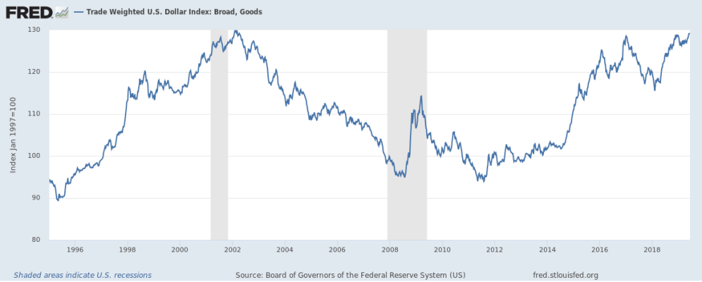
I had thought the FED was ending the 37 year bear market in interest rates last September, but the attempt to lift rates failed as economic gravity proved too strong for interest rate escape velocity. In October 2018 I didn't know if the FED really understood the issue that was before them in regards to demographics and the economy. I thought it was more appropriate in Dec 2018 to cut rates not to raise them. In October expectation and business forecast was for 3 rate increases in 2019 and GDP growth of 3 percent, the December 2018 fiasco of a rate hike shocked the FED and they have been in full verbal defense of the S&P500 since. However, as the chart in the post above shows the FED signalling of stopping rate hikes and cutting of rates is not sufficient to keep the trade weighted dollar from increasing, and it is back to the level of Dec 18th 2018 when the pressure really caused the problems for the US stock market. This is very bad for multinationals Expect a collapse in interest rates in the US that has occurred in the long end to really hit the short end as the breakout of the end of the interest rate cycle failed.
.....