You are using an out of date browser. It may not display this or other websites correctly.
You should upgrade or use an alternative browser.
You should upgrade or use an alternative browser.
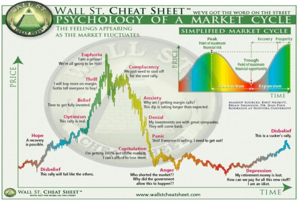
Where are we in the cycle?
- Thread starter Markola
- Start date
OP
OP
Markola
Thinks s/he gets paid by the post
I’m going to be optimist and say, Hope.
38Chevy454
Thinks s/he gets paid by the post
I think we are still in the disbelief stage. Too much house of cards feeling for me currently.
COcheesehead
Give me a museum and I'll fill it. (Picasso) Give me a forum ...
Disbelief
target2019
Give me a museum and I'll fill it. (Picasso) Give me a forum ...
Denial.
donheff
Give me a museum and I'll fill it. (Picasso) Give me a forum ...
I don't have a clue but it's gunna be different this time.
Al18
Thinks s/he gets paid by the post
Denial
- Joined
- Apr 14, 2006
- Messages
- 23,273
Spin cycle. Time to empty out the dryer and start folding.
- Joined
- Jul 1, 2017
- Messages
- 5,976

jimbee
Thinks s/he gets paid by the post
- Joined
- Oct 11, 2010
- Messages
- 1,234
My impression is a lot of people are at the anger stage.
ownyourfuture
Thinks s/he gets paid by the post
- Joined
- Jun 18, 2013
- Messages
- 1,561
I'd say it depends on the sector.
For technology (especially semiconductors) or anything remotely related to A-I.... it's euphoria.
For a majority of the remaining sectors, anxiety.
For technology (especially semiconductors) or anything remotely related to A-I.... it's euphoria.
For a majority of the remaining sectors, anxiety.
audreyh1
Give me a museum and I'll fill it. (Picasso) Give me a forum ...
Could it be complacency? On the other hand a whole lot of folks are still expecting a recession.
Cayman
Recycles dryer sheets
- Joined
- Nov 14, 2015
- Messages
- 447
Complacency for many I'd say.
timbervest
Recycles dryer sheets
Spin dry.
OP
OP
Markola
Thinks s/he gets paid by the post
So interesting. Given the low unemployment, the booming stock market, and the apparent end of rate hikes on the horizon, I assumed nearly everyone would have chosen either Disbelief, Hope or Optimism. Nope!
Last edited:
OP
OP
Markola
Thinks s/he gets paid by the post
I’d like to amend my question: Where do you think we are in the cycle and WHY?
There are no wrong answers, as none of us have a clue, just informed opinions.
There are no wrong answers, as none of us have a clue, just informed opinions.
So interesting. Given the low unemployment, the booming stock market, and the apparent end of rate hikes on the horizon, I assumed nearly everyone would have chosen either Disbelief, Hope or Optimism. Nope!
Just goes to show it's hard to see these things in real time. Always too close to the forest to see the trees. At the moment there's often enough reason to say we're anywhere along the spectrum.
Northforker
Recycles dryer sheets
Complacency, we're all in a canoe in fast slick water, theres a sharp bend up ahead and a few can see the mist rising!
Lsbcal
Give me a museum and I'll fill it. (Picasso) Give me a forum ...
Looking at the OP's chart and now looking at the SP500 over roughly 10 years:

I'm not quite seeing the color coding. Hmmm....
Perhaps there is some way of filtering to get the two to match?
I'm not quite seeing the color coding. Hmmm....
Perhaps there is some way of filtering to get the two to match?
Alex The Great
Recycles dryer sheets
Capitulation? I remember a few members of this forum sold everything.
target2019
Give me a museum and I'll fill it. (Picasso) Give me a forum ...
The OP chart is repeated in many iterations all over the internet. I could not find the first time it appeared. It may even be from a Wyckoff book.Looking at the OP's chart and now looking at the SP500 over roughly 10 years:
I'm not quite seeing the color coding. Hmmm....
Perhaps there is some way of filtering to get the two to match?
In the upper right of the chart you see the theoretical cycle. So, that is what you would fit your S&P price history to.
Other thoughts that eat away at this are that QE, Covid, and Fed rate hikes have impact, and have distorted the "normal" cycle in some way.
Maybe apply a log function to the price data, and that will get you to a better fit?
OP
OP
Markola
Thinks s/he gets paid by the post
^^^ The 200 Day Moving Average line encourages my stated guess that we’re close to Disbelief/Hope!
Last edited:
OP
OP
Markola
Thinks s/he gets paid by the post
There are, at all times, plenty of reasons to make a strong case for a stock market plunge on the horizon. I’m trying to stop worrying and love the bomb.
Similar threads
- Replies
- 6
- Views
- 1K
- Replies
- 30
- Views
- 909