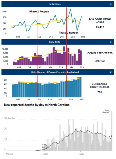
I give up. "Deaths" and "hospitalizations" seem to be more reliable than "cases" or "testing." but what could anyone conclude from this? Deaths undoubtedly lag hospitalizations, but how they could run counter to one another for weeks is hard to explain. Effective treatments haven't been found that I heard about. Guess I need to wait and watch.
Not that anyone here is trying to, but it would be easy to make a convincing case for improving or deteriorating progress for the state simply by choosing charts that agree with your established views. Some/many (news) sources are actively doing so...
Thanks for sharing these plots, indeed this is interesting. But I think, if you look at these plots in the right way, it is not quite incompatible, and one can actually draw quite firm conclusions. First, with "right" I of course mean, right in the statistician's eye, and not in the eye of any person who wants to make a point one way or another. There are several things going on:
1) There are enormous day-to-day fluctuations in three of the four curves. Besides noisy data, which are most pronounced in the death rates because there are low count rates and hence very large statistical errors, I think there are significant "weekend effects" showing up: the three fluctuating curves have pretty pronounced dips with seven day periods. These seem likely to be due to reporting habits - testers are less active on the weekends, hence confirmed cases are going down with the same rhythm. Note that the whole testing machinery has been put together from scratch very recently, and it is not a well oiled machine yet. Also, reporting of weekend deaths may happen only on Monday when the coroner's office is open again; death reporting has always happened historically of course, but there is no urgency of reporting, and whether the weekend is bundled into Monday doesn't matter much in normal times.
2) The two top curves about confirmed cases and completed tests correlate quite strongly, both in their seven day average, and even in their individual single day spike pattern. The seven day pattern (which can average out weekend effects nicely, different from say a ten day pattern) just means testing has fallen off a bit since May 11. But if you compute the ratio of positive tests to performed tests, this number stays rather steady. So overall, the top two curves are a bit confusing, but nothing to be alarmed about, and just say that the percentage of positive tests is fairly constant and testing is decreasing a bit.
3) The hospitalization curve is much smoother than the others, and shows a rather clear upward trend. Well, different from the testers and the coroner, the virus knows no weekend, and ERs work 7 days a week and have done so for decades. So recorded influx of cases is much more steady than any testing. Also note that the hospitalization curve is smoothing itself, since what you are showing is the total hospitalized patients, not the new admissions, and if a person spends say a week in hospital on average, then this curve represents a seven day averaging of new cases and may not even need further smoothing.
4) Note that there is a 2-3 week lag between hospitalization and death. Your hospitalization curve seems to fall until around 5/14; and that's all you see in the pattern of deaths. The rise in the hospitalization curve starting around 5/14 - about a week after Phase 1 Reopen - simply isn't reflected yet in the death curve, since only two weeks have passed since that time, and the larger number of newly admitted folks haven't had a chance to die yet (excuse the morbid terminology)
5) The main conclusion that I would draw from this is that looking at hospitalizations as you proposed several times may indeed be the most meaningful way of understanding the trends, because of the proportionality of infected vs subsequent hospitalization, which depends only on the properties of this particular virus but not on human actions, and because hospitals have a machinery that has been in place for decades and that doesn't introduce a weekend effect.
Finally, let me try to go out on a limb, to be compared to other data over the next weeks, and venture an estimate of the current R(t) from this: in your hospitalization curve, we go from roughly 460 on 5/14 to 580 on 5/29; if we assume average time from a person's infection to the infection of his infectees of 1 week, this increase of roughly 20 to 25% then yields an R(t)=1.1, give or take. And the jump from perhaps R(t)=0.95 happens right around the time when Round 1 Reopen leads to new hospitalizations.
")