Great Fidelity Chart

marko

Give me a museum and I'll fill it. (Picasso) Give me a forum ...
Joined
Mar 16, 2011
Messages
8,427
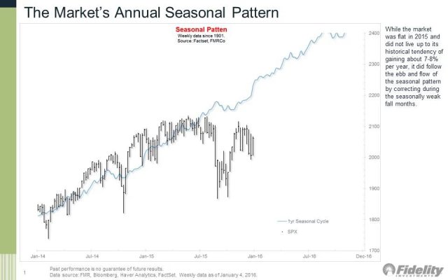
While I'm not a super fan of Fido, every now and then their Jurrien Timmer comes out with a chart like this.

I'm not sure I can explain it accurately but it's a weekly track of S&P's 'seasonal pattern' (average?) over the past 115 years. It takes into account all sort of factors and data including election years and so on.

Against that is last year's performance. If you look at the last six months the average (blue line) did predict the slowdown--just not as severe as actual.

The last chart like this (two years ago?) had a two year look-ahead and was spot on!

If this chart is equally on target, we could/should see a strong market improvement over the next few months.

Not trying to 'say' anything here. It's just a chart that I always look forward to and wanted to share. I'm also not quite sure how meaningful it is and would look to some of our more seasoned investors to provide an assessment.

As always YMMV and, yes, I know, "past performance doesn't guarantee...."
 

Attachments

  • IMG_20160104_190315 (1).jpg
    IMG_20160104_190315 (1).jpg
    88.1 KB · Views: 139
I think such charts suffer from the inclusion of what one might call "outliers", so that the charts are meaningless.

What does the "average" look like if one removes October 1929, 1987, and 2008?

Actually, it doesn't matter what it looks like if those are removed. It would just increase the noise and make it look like signal.
 
Like most attempts to predict the market, they're great until they're not. The only prediction that seems to work is markets go up long term in a strong/growing economy, but short term they can diverge for all sorts of reasons. Long term can take a long while some periods...so can short term.
 

Attachments

  • Peter-Williams-DJIA-quartile-complete.png
    Peter-Williams-DJIA-quartile-complete.png
    140.6 KB · Views: 71
Last edited:
I think such charts suffer from the inclusion of what one might call "outliers", so that the charts are meaningless.

What does the "average" look like if one removes October 1929, 1987, and 2008?

Actually, it doesn't matter what it looks like if those are removed. It would just increase the noise and make it look like signal.

Good input. My only other data point is that the previous chart's 2 year look-ahead came out very accurate, so maybe it was coincidence.
 
In the long term, we are all dead.
 
"The only function of economic forecasting is to make astrology look respectable."

- John Kenneth Galbraith

See this:

Patternicity: Finding Meaningful Patterns in Meaningless Noise - Scientific American

Specifically:

Why do people see faces in nature, interpret window stains as human figures, hear voices in random sounds generated by electronic devices or find conspiracies in the daily news? A proximate cause is the priming effect, in which our brain and senses are prepared to interpret stimuli according to an expected model...I call it “patternicity,” or the tendency to find meaningful patterns in meaningless noise.

Emphasis added
 
"The only function of economic forecasting is to make astrology look respectable."

Darn and here I thought this would be an easy way to get rich.
 
Like most attempts to predict the market, they're great until they're not. The only prediction that seems to work is markets go up long term in a strong/growing economy, but short term they can diverge for all sorts of reasons. Long term can take a long while some periods...so can short term.
100% correct. Charts are a coin flip. Sometimes seem great, but then will fail. Our brains are programmed to seek out trends, but nothing requires the trend to hold. I recommend 'Your Money and Your Brain' by Jason Zweig.
 
In the long term, we are all dead.

This is eternally true.

However, Keynes meant for us to consider what happens, or what we can do, prior to death. Are we good to party, or do we cower in a corner, cold, scared, and hungry, then die?

I submit for your consideration that it does make a whole lot of difference.

"The long run is a misleading guide to current affairs. In the long run we are all dead. Economists set themselves too easy, too useless a task if in tempestuous seasons they can only tell us that when the storm is past the ocean is flat again." - John Maynard Keynes
 
Last edited:
Back
Top Bottom